All posts by marktuchman

A Hanukkah Story

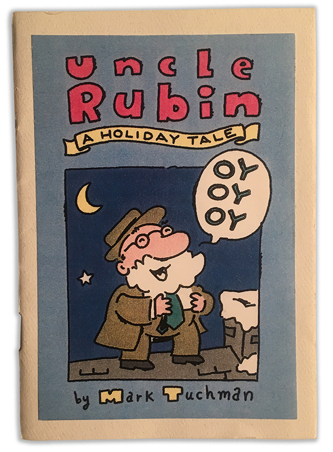
IMG_2242_adjA couple of years ago I resolved to finally develop a picture book concept I had been sitting on since 1992.

It all started out as a Hanukkah/Christmas holiday card. As a Jewish New Yorker who had recently moved to Colorado, I guess it is not entirely surprising that my holiday greeting was a Jewish spin on the Santa Claus myth.

I drew the pictures by hand, and then used my state-of-the-art Mac IIcx (16Mhz engine, 40 MB harddrive!) to prepare the files in Quark Xpress 2.12, only to print them out, make copies at the local copy shop, cut, score, fold, staple, and glue down the full-color cover!

The booklet was a hit among the roughly 60 friends and family who received it. I produced a revised version a few years later. A few have since suggested I turn it into a “real” book. But I was too busy with my fledgling illustration business, and there was just no time to take this project to the next level.
SantaSays_2versionsA few short years later, I moved back to New York City, found a salaried job, got married, had children—basically life moved along. I worked on a few independent creative projects during these years, but not Uncle Rubin. A couple of years ago, it dawned on me: I’ll never have the time if I don’t make the time. So I commandeered my wife’s drafting table (thanks Michelle) and got to work.

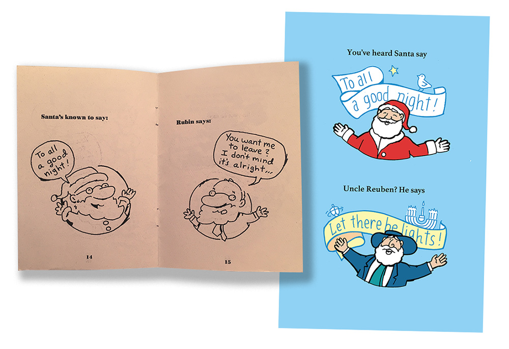
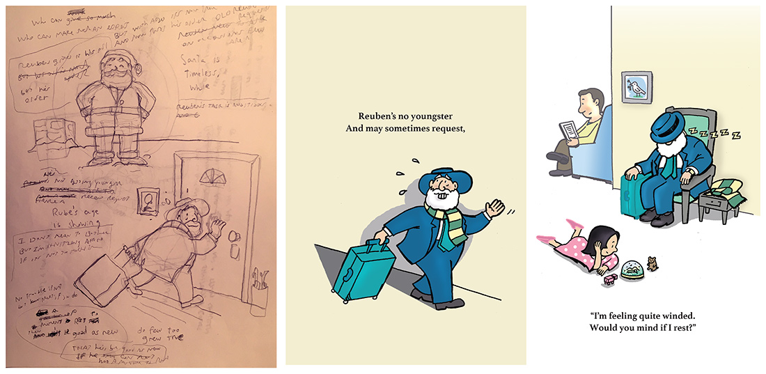
The drawings in the original booklet were simple as the page size was small. There was minimal background and little detail. I needed new drawings that would fill the larger format. Also, the text needed to be refined to make Reuben (new spelling) a more positive character. For instance in the first version he was a bit of a martyr. See before and after (right).
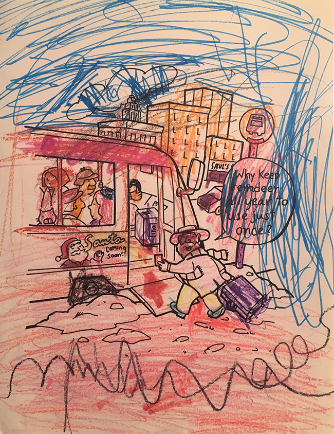
IMG_2248_scribbleKnowing that this new version of Uncle Reuben would likely be read by people who did not know me personally, made me think more carefully about Reuben as a character. Back in 1992, I didn’t think too much about “cultural sensitivity” when it came to self-deprecating humor about my own cultural background and experiences. My goal was now to find that sweet spot where cultural distinctions are warmly parodied without feeding into negative stereotypes.

With three young children and a demanding day job, I had to find time to work in between the cracks—late nights, weekends. Occasionally my children would embellish my work:

Once a new rough draft of the entire book was in place, I finally felt I had a solid foothold in the project. Some of the sketches and wording weren’t quite right at this point, but I had so much time to mull it over and try out other options during the time I was inking and coloring the other pages. I’m not the kind of illustrator who strikes gold on the first pass. I patiently work my way through version after version. So I have dozens of sketches for each page in the book. Here’s an example of a page where I was working out the verse (in a secret chicken-scratch language) and images, with the final pages next to it:

Sketch2Kvetch


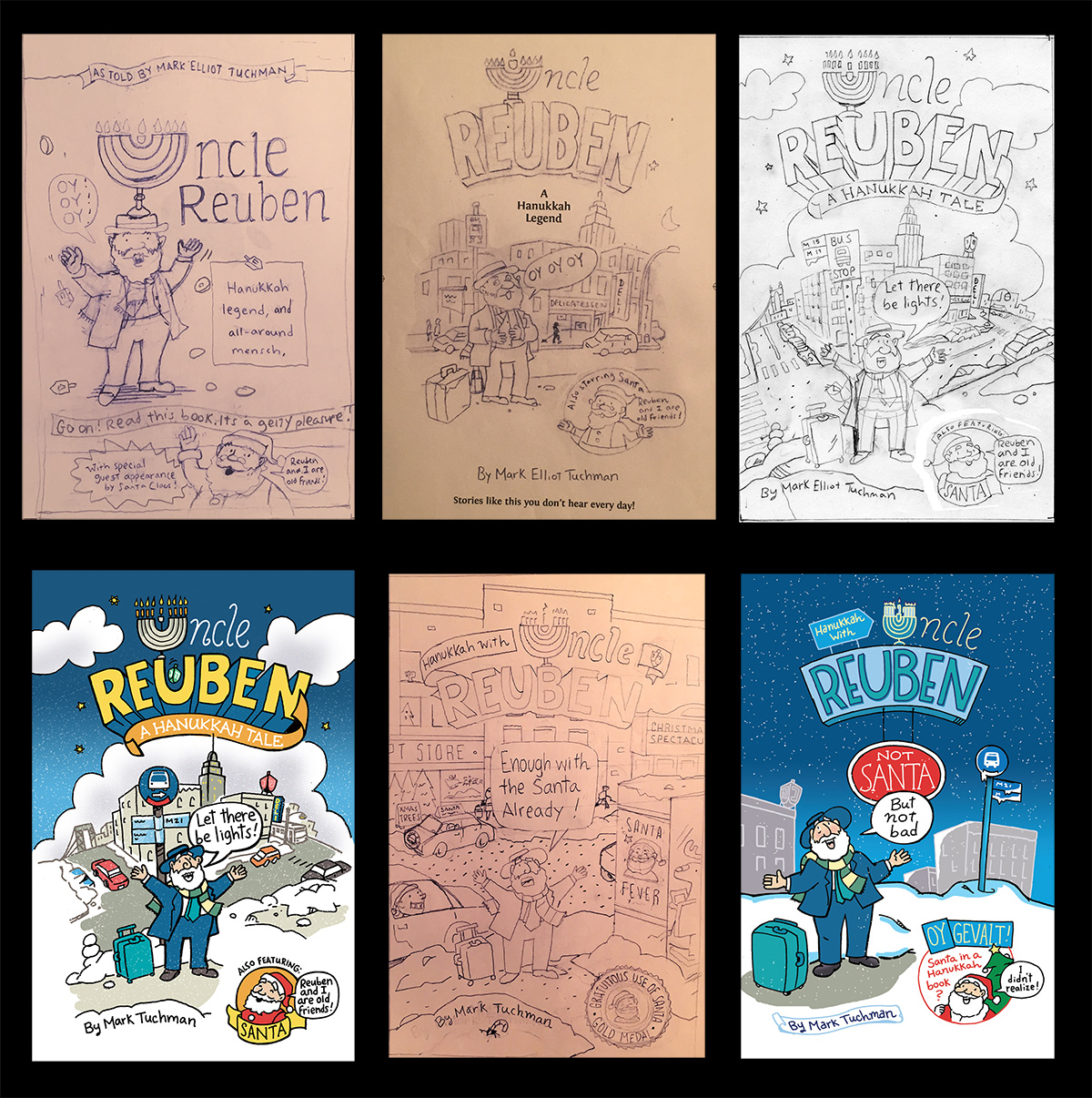
Here are some of the many incarnations of the cover:

6covers_sm


The final art was drawn by hand with felt tip markers, scanned in, colored in Photoshop CS3, and placed in InDesign CS3.

I am grateful for my friends who helped me along the way with suggestions and critiques of the book. They had a major impact on the final product including the name of the book, the first and last pages, and, hmmm, everything in-between. Gee, thanks guys! They are thanked by name on the copyright page.

When the work was 99.99% done I registered for a copyright, and purchased ISBNs. I invested in Adobe Creative Cloud, and with InDesign CC was able to generate a mostly-error-free EPUB file. With the help of tutorials (a tip of the kippa to Anne-Marie Concepcion—the Julia Child of InDesign) I was able to troubleshoot the errors that were causing the file to be rejected by Apple’s iBook Store.

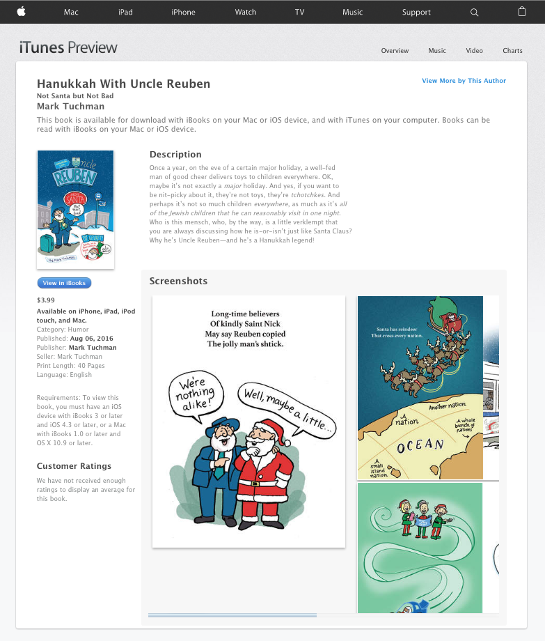
Overall I was surprised and delighted to see how quickly I went from deciding I was ready to roll, to having a book in the Apple iBook Store. How cool after all my efforts to see my book on the iTunes page!

Screen Shot 2016-08-06 at 9.32.18 AM

I chose to self-publish because of my eagerness to get the book out there fast after waiting 23 years! Of course self-publishing is no easy road, but with the changing book publishing industry and advancements in technology, now is a pretty good time to try. I love to learn new skills and there are many to learn as I work towards producing and promoting this book. Of course if there is a publisher or agent out there who likes what they see and wants to convince me to leave publishing to the professionals, I am all ears!

What’s next? Plenty: A web site for the book; various publicity ideas; producing a print version of Uncle Reuben; etc. I do not expect to be one of those people with cartons of books in their car trunk or in their garage. This is because I don’t own a car and live in an apartment. So, I guess I have no choice but to move product!

I’ll report back to you here once I get to that next level! In the meantime you can find Hanukkah With Uncle Reuben: Not Santa but Not Bad at the iBook Store.

Update: It’s been twelve weeks since this post and so much has happened. The print book is available on Amazon and in select bookstores. And you can read all about it at unclereuben.com!


Explanation Graphics 2.0

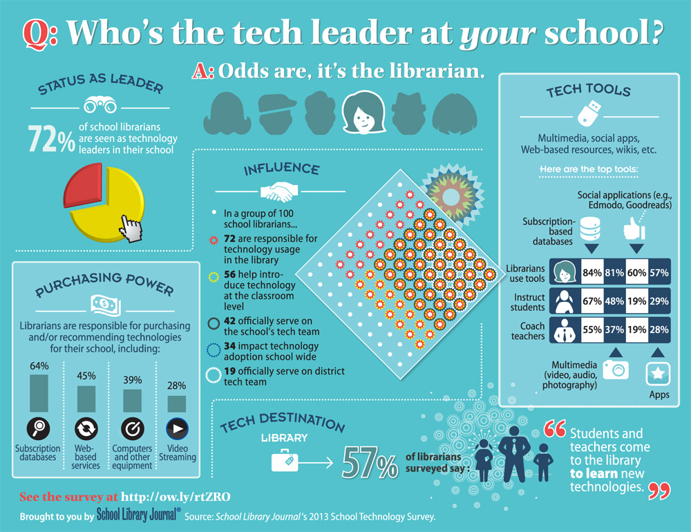
LibraryLeader-Infographic_OL_v3


Nigel Holmes’ “explanation graphics” in Time Magazine in the 80’s and 90’s were my introduction to what is now commonly referred to as infographics. Nigel’s clever graphic solutions that infused statistics with meaning and grabbed readers’ attention with its visual charm, made me want to do them too! As a freelance illustrator and magazine art director/designer I did on occasion create charts, graphs, and illustrated maps. As with Nigel Holme’s work, the new crop of infographics sprouting up everywhere around the interwebs has once again captured my attention and inspired me to want to try my hand at it.

At School Library Journal where I am the art director, I was asked to commission an infographic based on findings from a recent technology survey. I quickly discovered that this is a specialty field and it wasn’t going to be as easy finding a “data visualizer” as it is to find an illustrator or graphic artist. Many infographics do not include artist credits which I began to realize meant that the work was collaborative in-house (organization) or agency efforts.

So I tackled this one myself (with the support of SLJ‘s editors of course, and our in-house researcher who provided and helped parse the data). I learned a lot about the process. A good infographic in my opinion is a combination of appealing graphics and illustration, and provocative, succinct writing. But at the heart of an infographic, I believe, is data visualization—delivering information to the reader in a way that provides context, gives meaning, and is memorable.

Think Global, Design Local

GoldenFarm3Ten years ago, we moved to Kensington, a neighborhood right in the center of Brooklyn N.Y. With no car, we were grateful for a certain conveniently located grocery store with a wide selection of international foods and decent prices. But we quickly realized that Golden Farm was far from golden. Some examples: Customers attempting a return for any reason were always refused. It often got heated; on occasion perishable foods were on the verge of their expiration date and fruit would never last more than a day or two after purchase; the cashiers never gave you your receipt unless you asked for it; and I had my own run-ins with the store management, most notably when they tried to charge me for a small container of hummus that fell and broke open in-store, that was arguably not even my fault. But did I mention that the store was convenient and had no real competition?

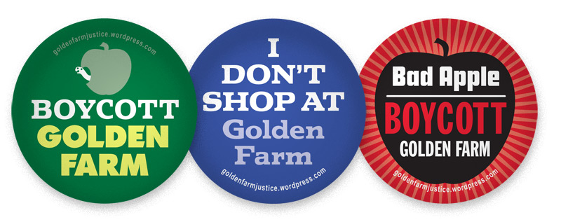
GoldenFarmButton

So if they treat their customers badly can you imagine how they treat their workers? The community found out about a year ago when workers sued the store’s owner claiming (among other violations) that they were being paid well-below the legal minimum wage. Community groups stepped up to help represent the workers, and a unionizing effort was initiated. Read all about it here.  A big boycott ensued. Some progress was made and the boycott was called off. But that wasn’t the end of it…

Heading home recently on a late summer evening, my twin girls who are three, wanted ice cream. I  turned the corner where Golden Farm is located. That’s when I discovered the boycott was back on again. Eleanor, a community organizer (see Facebook post at left) was there. We started talking and she filled me in on the latest. I offered my design services. She took my info. And the girls and I went across the street to the pharmacy and bought our ice cream there.

That night I created some designs for buttons that are now circulating around the neighborhood. I am happy to be able to contribute to a good cause within my local community and to support the workers. And for me, this all started with a small container of hummus…

Going Under Cover

UC_DMGill
Photo by Brownie Harris.
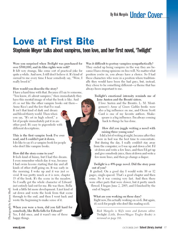
UC_2005_Meyer567X755_sm
Photo by Karen Shell.

In 2005 School Library Journal introduced a monthly interview column called ‘Under Cover.’ The page was to be a short, conversational interview paired with a quirky photo portrait—a friendly introduction to mostly up-and-coming authors and their new books.

The first ‘Under Cover’ subject was a new author named Stephenie Meyer whose book, ‘Twilight,’ was getting a lot of buzz. She was in Arizona, and so I contacted Karen Shell, a great photographer in the area. Karen, Stephenie, and I began an email correspondence about the project and we discussed infusing concept into the portrait. Stephenie nailed it, posing with an apple (from the cover of her novel) and dressed in a sleek vampire-black outfit.

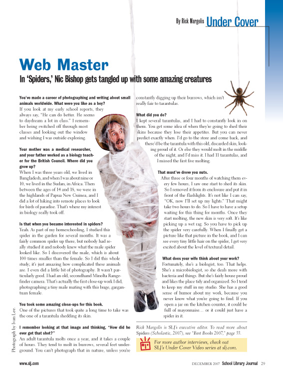
NBishopStephenie Meyer with her debut novel, and a three-book contract already inked, was off to a great start, and so was our ‘Under Cover ‘column. Within a year we had interviewed and photographed Gene Yang, Jonathan Stroud, Catherine Gilbert Murdoch, Emily Gravett, Philip Reeve, and John Green, among others! In 2008  Suzanne Collins appeared on the page being interviewed about her new book, The Hunger Games. After a while it didn’t matter if the author was new or already established—‘Under Cover’ became our monthly format for short, energetic, interviews with authors of great, new books.

What I enjoyed most about these shoots, whether I art directed remotely or in-person, was the collaboration between myself, the author, and the photographer. A great example of this was when  enthusiastic and irrepressible Australian photographers Ivan Lee and Nic Bishop came up with a far-fetched plan involving spider webbing—lots of it—as Nic Bishop’s beautiful new photography book was about spiders. This may be my favorite ‘Under Cover’ photo ever because of Ivan and Nic’s commitment to going so completely over-the-top!

See more ‘Under Cover’ samples here.


Battle Plan 2013

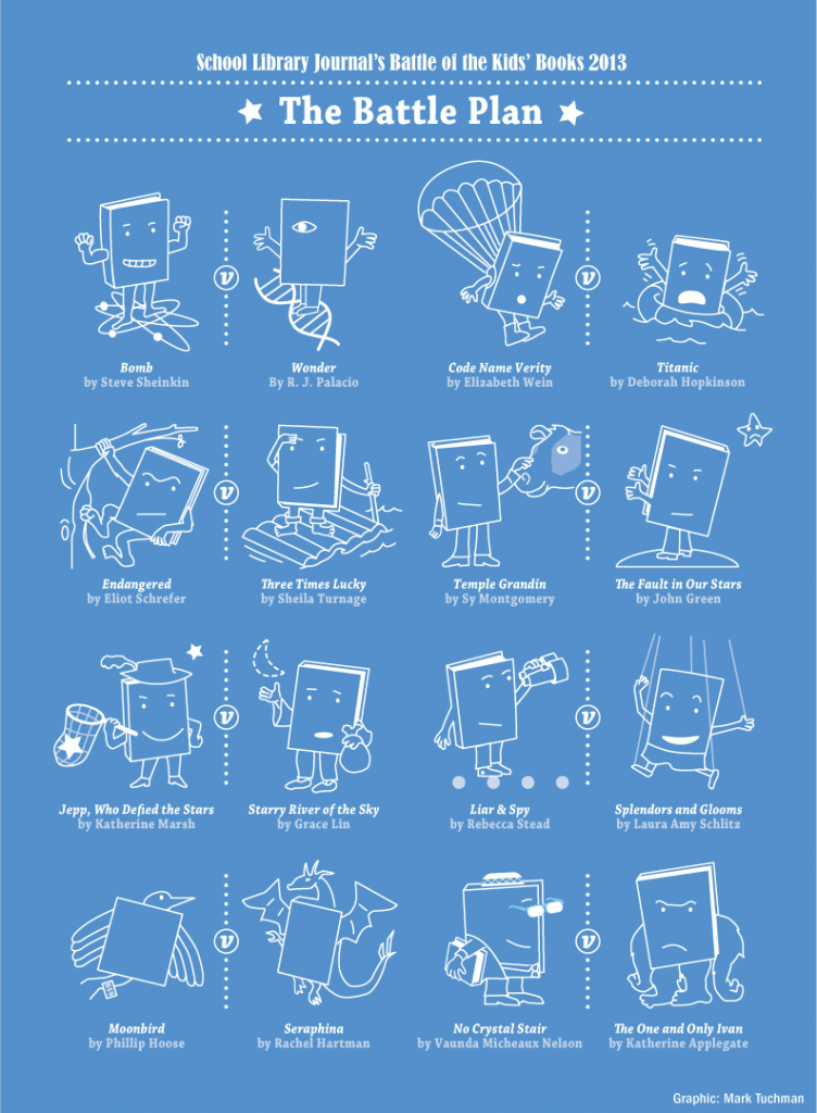
BattlePlans_600PX_web

Five years ago, Monica Edinger and Roxanne Feldman of the Dalton School approached School Library Journal with an idea for a “March Madness” of children’s books—basically an online elimination tournament where 16 books are paired up , and after a series of matches, one book emerges victorious . The contest aspect was just a gimmick—a quirky and engaging way for Monica and Roxanne to share and discuss great books. SLJ accepted and the Battle of the Kids’ Books was born.

BOB_2009_logo

Rick Margolis, who was the senior editor at the time, was enthused about this new project, and suggested contacting big-name authors as judges. This was a stroke of genius because it ensured many wonderfully entertaining write-ups per battle. The judges in the first year included: Jon Scieszka, Tamora Pierce, John Green, Lois Lowry, Meg Rosoff, Coe Booth, Elisabeth Partridge, and more! A ‘Who’s Who’ of kid lit! And they did not disappoint. Many of the new books Monica and Roxanne chose in 2009 are classics now: The Graveyard Book, The Hunger Games, Octavian Nothing Vol II, We Are the Ship, etc.

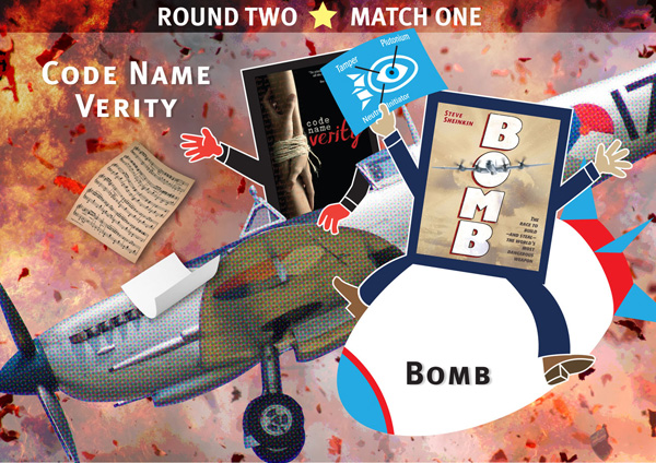
I created graphics for the micro site. My plan was to keep them simple as a personal challenge, and also as a practical matter! So I drew anthropomorphized books that were basically rectangles with skinny arms and legs, and I made them in Adobe Illustrator, using a mouse. Here, at right,  is the first BoB logo from 2009.

And although the artwork has gotten more elaborate from year to year, they’re ultimately still the same rectangles with appendages.

2_1_Bomb_Verity_smcommentators_kids_f